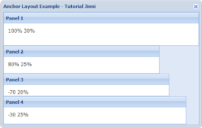
The Anchor Layout allows anchoring the container's children according to its dimension. If you re-size the outer container, all its children will be automatically re-sized according to the children's anchor rules. Just like the Auto Layout, the Anchor Layout also stacks its children according to the order they were added or declared in, in the items config.
For example, we have four panels and we want to add them in a Window using the Anchor Layout:
Going back to the beginning of the code, we declared four panels. Each one has a title and HTML content. We also set an anchor rule for each one:
If we try to re-size the Window, all its children will be re-sized according to their
anchor rules. Let's try to re-size the window to a bigger size to see what happens:
When we compare the two previous screenshots, we see that when we re-sized the window, it maintained the child panels proportional to their original size.
For example, we have four panels and we want to add them in a Window using the Anchor Layout:
<!DOCTYPE html PUBLIC "-//W3C//DTD XHTML 1.0 Transitional//EN" "http://www.w3.org/TR/xhtml1/DTD/xhtml1-transitional.dtd">
<html xmlns="http://www.w3.org/1999/xhtml">
<head>
<meta http-equiv="Content-Type" content="text/html; charset=utf-8" />
<title>Extjs 4 Anchor Layout Example</title>

<link rel="stylesheet" type="text/css" href="http://extjs-public.googlecode.com/svn/extjs-4.x/release/resources/css/ext-all.css" />

<script type="text/javascript" src="http://extjs-public.googlecode.com/svn/extjs-4.x/include/ext-all.js"></script>

<script type="text/javascript">

Ext.onReady(function(){

 var panel1 = Ext.create('Ext.panel.Panel', {
  title: 'Panel 1',
  html: '100% 30%',
  anchor:'100% 30%'
 });

 var panel2 = Ext.create('Ext.panel.Panel', {
  title: 'Panel 2',
  html: '80% 25%',
  anchor:'80% 25%'
 });

 var panel3 = Ext.create('Ext.panel.Panel', {
  title: 'Panel 3',
  html: '-70 20%',
  anchor:'-70 20%'
 });

 var panel4 = Ext.create('Ext.panel.Panel', {
  title: 'Panel 4',
  html: '-30 25%',
  anchor:'-30 25%'
 });

 var anchor = Ext.create('Ext.window.Window', {
  title: 'Anchor Layout Example - Tutorial Jinni',
  width: 250,
  height:300,
  layout:'anchor',
  defaults: {
         bodyStyle: 'padding:10px'
        },
  items: [panel1, panel2, panel3, panel4]
 });
 anchor.show();
});
</script>
</head>

<body>
</body>
</html>
Let's explain the code starting from the last element declared, which is the Window named anchor. This window has a title, width(250 pixels), height(300 pixels) and is using the Anchor Layout. It also has four children declared in the items config.
Going back to the beginning of the code, we declared four panels. Each one has a title and HTML content. We also set an anchor rule for each one:
- The first panel (panel1) has an anchor specified as 100% of the parent's width(250 pixels, originally) and 30% of the parent's height(30% of the parent's height = 30% of 300 = 90 pixels).
- The second panel (panel2) has an anchor specified as 80% of the parent's width(80% of 300 = 200 pixels) and 25% of the parent's height(25% of 300 = 75 pixels).
- The third panel (panel3) has an anchor specified as -70 pixels of offset which means this panel will leave 70 pixels of space on the right side of the parent's body and 20% of the parent's height (20% of 300 = 60 pixels).
- The fourth panel (panel4) has an anchor specified as -30 of offset which means this panel will leave 30 pixels of space on the right side of the parent's body and 25% of the parent's height(25% of 300 = 75 pixels).


0 comments:
Post a Comment